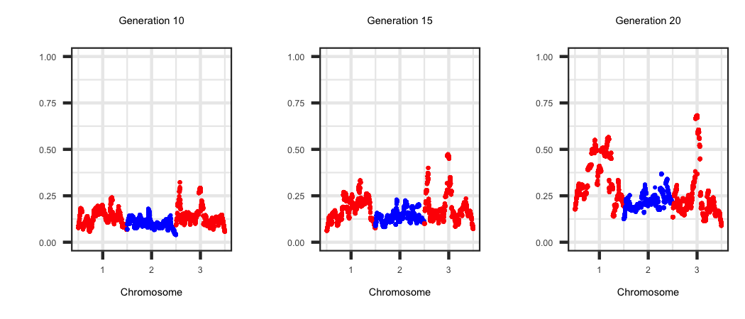
Overview of Summary Statistics.
A large number of summary statistics that range from genetic diversity, genetic values and fitness related metrics are generated by default within Geno-Diver
for each generation. A subset of these summary statistics have been outlined in the previous examples and each one is described in detail within the "Output Files"
link on the homepage. The user can output even more summary statistics by including extra parameters in a parameter file that are by default not calculated. The
supplemental summary statistics include linkage dis-equilibrium decay, linkage phase persistance, run-of-homozygosity across the genome and the true additive and dominance
variation across the genome for each generation. The parameter file below illustrates the parameters to include to generate the previously mentioned summary
statistics.
−−−−−−−| Overview of Summary Statistics |−−−−−−−
−| General |−
START: sequence
SEED: 1501
−| Genome & Marker |−
CHR: 3
CHR_LENGTH: 150 150 150
NUM_MARK: 4000 4000 4000
QTL: 200 200 200
−| Population |−
FOUNDER_Effective_Size: Ne100_Scen1
MALE_FEMALE_FOUNDER: 50 400 random 3
VARIANCE_A: 0.25
−| Selection |−
GENERATIONS: 20
INDIVIDUALS: 50 0.2 400 0.2
PROGENY: 1
SELECTION: ebv high
PARITY_MATES_DIST: 2.0 1.0
EBV_METHOD: pblup
CULLING: ebv 10
-| Mating |-
MATING: random
-| OUTPUT OPTIONS |-
OUTPUT_LD: yes
GENOME_ROH: 5 5 10 15 20
WINDOWQTLVAR: yes
Outlined below is a summary of each metric and some R code that generates a plot of the data.
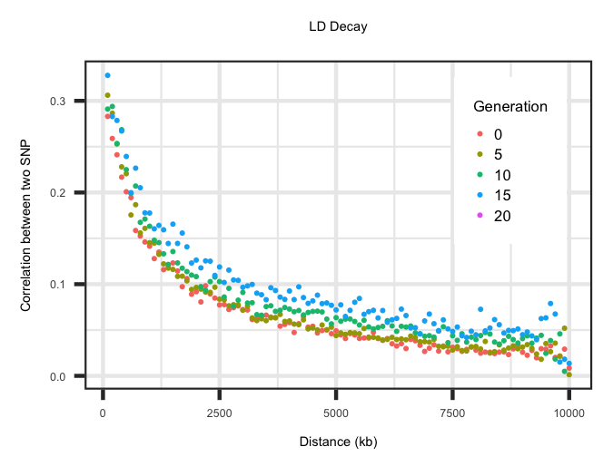
LD Decay Across Generations
Within the "LD_Decay" file the average correlation (r2) between two SNP across a range of distances is outlined. The first row specifies the distance in
kilobases. Any row after the first is then the LD decay for a given generation. The code below grabs the LD decay for generations 0, 5, 10, 15 and 20 and plots
the LD decay by generation. When specifying your own founder population history this can be utilized to determine whether you have the LD decay you desire.
R-Code
rm(list=ls()); gc()
library(ggplot2); require(gridExtra); require(grid)
setwd("/Users/jeremyhoward/Desktop/C++Code/SamplingGamates/17_GenoDiver_V2/GenoDiverFiles")
df <- read.table(file="LD_Decay",sep=" ",header=FALSE);
Distance <- df[1, ]; df <- df[-c(1), ];
generations <- c(1,6,11,16,21)
for(i in 1:length(generations))
{
tempdf <- data.frame(cbind(t(Distance),t(df[generations[i], ])),stringsAsFactors = FALSE)
tempdf$gen <- generations[i] -1;
names(tempdf) <- c("Distance","r2","Generation")
if(i == 1){plotdf <- tempdf;rm(tempdf)}
if(i > 1){plotdf <- rbind(plotdf,tempdf); rm(tempdf)}
}
plotdf$Generation <- as.factor(as.numeric(plotdf$Generation))
ggplot(plotdf, aes(x=Distance, y = r2, colour = Generation)) + geom_point(size = 1) +
labs(title = "LD Decay", x = "Distance (kb)", y = "Correlation between two SNP") + theme_bw() +
theme(plot.title = element_text(size = 16,hjust = 0.5),axis.title = element_text(size = 12),
legend.position="bottom",axis.text=element_text(size=10))

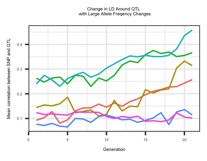
LD Decay around QTL
Within the "QTL_LD_Decay" file the average correlation (r2) between a SNP within 2.5 Mb of a QTL and the associated QTL is outlined across all QTL. The
first column represents the chromosome and the second column represents the position in Mb. The average correlation was binned into distances of 0 - 0.5 Mb,
0.5 - 1.0 Mb, 1.0 - 1.5 Mb, 1.5 - 2.0 Mb and 2.0 - 2.5 Mb from the QTL. The last column is the average correlation within a generation across the different
window sizes. Correlations within a generation across windows are separated by a ":" and sets of correlations across generations are seperated by a "_".
The R code below outlines the change in LD decay surrounding QTL with a large change in allele frequency across generations. The change in LD is an average across all
5 window categories.
R-Code
rm(list=ls()); gc()
library(ggplot2); require(gridExtra); require(grid)
setwd("/Users/jeremyhoward/Desktop/C++Code/SamplingGamates/17_GenoDiver_V2/GenoDiverFiles")
df <- read.table(file="QTL_LD_Decay",sep=" ",header=TRUE,colClasses=c("numeric","numeric","character"));
qtl <- read.table(file="QTL_new_old_Class",sep=" ",header=TRUE,colClasses=c("numeric",rep("character",6)))
freq <- matrix(unlist(strsplit(qtl[,7],"_")),nrow=nrow(qtl),byrow=TRUE)
freq <- apply(freq,2,as.numeric)
X <- which(abs((freq[,1] - freq[,21])) > 0.35)
for(i in 1:length(X))
{
temp <- apply(matrix(unlist(strsplit(unlist(strsplit(df[X[i],3],"_")),":")),ncol=5,byrow=TRUE),2,as.numeric)
if(as.numeric(length(which(temp == -5))) == 0)
{
temp <- rowMeans(temp)
temp <- data.frame(cbind(rep(i,length(temp)),temp,c(1:length(temp))))
if(i == 1){plotdf <- temp;rm(temp)}
if(i > 1){plotdf <- rbind(plotdf,temp); rm(temp)}
}
}
names(plotdf) <- c("QTL","r2","Generation")
plotdf$QTL <- as.factor(plotdf$QTL)
ggplot(plotdf, aes(x=Generation, y = r2, colour = QTL)) + geom_line(size = 1) +
labs(title = "Change in LD Around QTL \n with Large Allele Freqency Changes", x = "Generation", y = "Mean correlation between SNP and QTL") + theme_bw() +
theme(plot.title=element_text(size=16,hjust=0.5),axis.title=element_text(size=12),legend.position="none" ,axis.text=element_text(size=10))

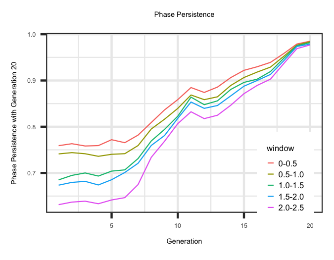
Persistence of Phase
Within the "Phase_Persistance_Generation" file the correlation between LD phase within different window sizes across generations is estimated. The LD phase is the
square root of the correlation between a SNP and QTL and is the same sign as the LD parameter (D). he first column is the generation and the columns following would be
the correlation between the current generation and preceding generations. The R code below outlines the change in phase persistence for the animals born in generation 20
compared to the preceding generations by window size.
R-Code
rm(list=ls()); gc()
library(ggplot2); require(gridExtra); require(grid)
setwd("/Users/jeremyhoward/Desktop/C++Code/SamplingGamates/17_GenoDiver_V2/GenoDiverFiles")
df <- read.table(file="Phase_Persistance_Generation",sep=" ",header=FALSE);
df <- matrix(unlist(strsplit(t(df[20,-c(1)]),":")),ncol=5,byrow=TRUE)
distance <- c("0-0.5","0.5-1.0","1.0-1.5","1.5-2.0","2.0-2.5")
for(i in 1:5)
{
temp <- data.frame(cbind(df[,i],rep(distance[i],nrow(df)),1:nrow(df)),stringsAsFactors = FALSE)
names(temp) <- c("phase","window","Generation")
if(i == 1){plotdf <- temp;rm(temp)}
if(i > 1){plotdf <- rbind(plotdf,temp); rm(temp)}
}
plotdf$phase <- as.numeric(paste(plotdf$phase)); plotdf$Generation <- as.numeric(paste(plotdf$Generation));
str(plotdf)
ggplot(plotdf, aes(x=Generation, y = phase, colour = window)) + geom_line(size = 1) +
labs(title = "Phase Persistence", x = "Generation", y = "Phase Persistence with Generation 20") + theme_bw() +
theme(plot.title = element_text(size = 16,hjust = 0.5),axis.title = element_text(size = 12),legend.position="bottom",axis.text=element_text(size=10))

Run of Homozygosity (ROH)
Within the "Summary_Statistics_ROH_Freq" file the frequency of a SNP being in a continuous run of homozygosity (ROH) of at least 5 Mb was calculated. This was used due to
longer ROH arise in the genome as a result of recent inbreeding. The R code below outlines the changes and heterogeneity of the frequency of a SNP being in a ROH as
selection proceeds.
R-Code
rm(list=ls()); gc()
library(ggplot2); require(gridExtra); require(grid)
setwd("/Users/jeremyhoward/Desktop/C++Code/SamplingGamates/17_GenoDiver_V2/GenoDiverFiles")
df <- read.table(file="Summary_Statistics_ROH_Freq",sep=" ",header=TRUE);
df$row <- 1:nrow(df)
generations <- c(5,10,15,20)
Plots <- vector('list',4);
for(i in 1:length(generations))
{
tempdf <- df[ ,c(1,2,7,(i+2))]; names(tempdf) <- c("chr","pos","row","freq")
tempdf <- tempdf[which(tempdf$freq != -5), ]
agg.snp <- aggregate(row ~ chr, data=tempdf, FUN=mean); breaks.snp <- round(agg.snp$row, 0)
title <- paste("Generation ",generations[i],sep="")
if(i == 1)
{
Plots[[i]] <- ggplot(tempdf, aes(x=row, y = freq,colour = as.factor(chr))) + geom_point(size = 0.01) + ylim(0.0,0.40) +
labs(title = title, x = "Chromosome", y = "Frequency of a SNP in a ROH of 5 Mb ") + theme_bw() +
scale_color_manual(values=c("red","blue","red")) + scale_x_continuous(breaks= breaks.snp,labels=c("1","2","3")) +
theme(plot.title=element_text(size=3.5,hjust=0.5),axis.text=element_text(size=3),axis.title=element_text(size=3.5),
legend.text = element_text(size = 4.0),legend.position="none")
}
if(i > 1)
{
Plots[[i]] <- ggplot(tempdf, aes(x=row, y = freq,colour = as.factor(chr))) + geom_point(size = 0.01) + ylim(0.0,0.40) +
labs(title = title, x = "Chromosome", y = "") + theme_bw() +
scale_color_manual(values=c("red","blue","red")) + scale_x_continuous(breaks= breaks.snp,labels=c("1","2","3")) +
theme(plot.title =element_text(size=3.5,hjust=0.5),axis.text=element_text(size=3),axis.title=element_text(size=3.5),
legend.text = element_text(size = 4.0),legend.position="none")
}
}
Plots[[1]]
Plots[[2]]
Plots[[3]]
Plots[[4]]

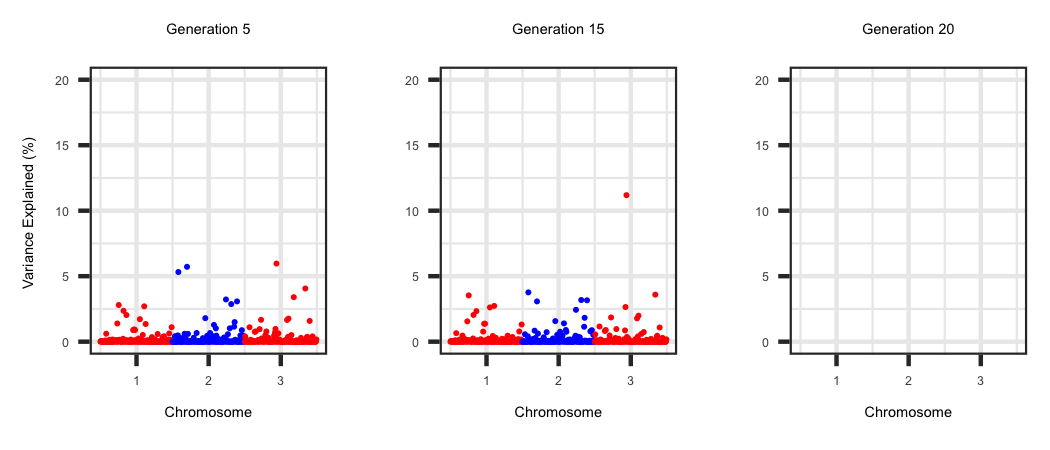
Window Variance
Within the "WindowAdditiveVariance" file the true additive genetic variance within 1 Mb non-overlapping across the genome is generated. Each row corresponds to
a generation and the locations are outlined in the first row. The R code below outlines the change in the amount of additive genetic variance across the genome as
selection proceeds.
R-Code
rm(list=ls()); gc()
library(ggplot2); require(gridExtra); require(grid)
setwd("/Users/jeremyhoward/Desktop/C++Code/SamplingGamates/17_GenoDiver_V2/GenoDiverFiles")
df <- read.table(file="WindowAdditiveVariance",sep=" ",header=FALSE);
Locations <- data.frame(cbind(t(df[1,c(2:ncol(df))]),1:(ncol(df)-1)),stringsAsFactors = FALSE)
Locations$chr <- matrix(unlist(strsplit(Locations$X1,"_")),ncol=2,byrow=TRUE)[,1]
Locations$pos <- matrix(unlist(strsplit(Locations$X1,"_")),ncol=2,byrow=TRUE)[,2]
Locations <- Locations[ ,c(2,3,4)];
names(Locations) <- c("row","chr","pos")
Locations$row <- as.numeric(paste(Locations$row)); Locations$chr <- as.numeric(paste(Locations$chr));
generations <- c(5,15,20)
Plots <- vector('list',length(generations));
for(i in 1:length(generations))
{
tempdf <- cbind(Locations,t(df[generations[i]+2,c(2:ncol(df))]));
tempdf[,4] <- as.numeric(paste(tempdf[,4]))
tempdf[,4] <- (tempdf[,4] / sum(tempdf[,4])) * 100;
names(tempdf)[4] <- "varianceexp"
agg.snp <- aggregate(row ~ chr, data=tempdf, FUN=mean); breaks.snp <- round(agg.snp$row, 0)
title <- paste("Generation ",generations[i],sep="")
if(i == 1)
{
Plots[[i]] <- ggplot(tempdf, aes(x=row,y= varianceexp,colour = as.factor(chr))) + geom_point(size=0.01)+ ylim(0.0,20) +
labs(title = title, x = "Chromosome", y = "Variance Explained (%) ") + theme_bw() +
scale_color_manual(values=c("red","blue","red")) + scale_x_continuous(breaks= breaks.snp,labels=c("1","2","3")) +
theme(plot.title=element_text(size=3.5,hjust = 0.5),axis.text=element_text(size=3),axis.title=element_text(size=3.5),
legend.text = element_text(size = 4.0),legend.position="none")
}
if(i > 1)
{
Plots[[i]] <- ggplot(tempdf, aes(x=row, y = varianceexp,colour = as.factor(chr)))+geom_point(size=0.01) + ylim(0.0,20) +
labs(title = title, x = "Chromosome", y = "") + theme_bw() +
scale_color_manual(values=c("red","blue","red")) + scale_x_continuous(breaks= breaks.snp,labels=c("1","2","3")) +
theme(plot.title = element_text(size=3.5,hjust=0.5),axis.text=element_text(size=3),axis.title=element_text(size=3.5),
legend.text = element_text(size = 4.0),legend.position="none")
}
}
Plots[[1]]
Plots[[2]]
Plots[[3]]
