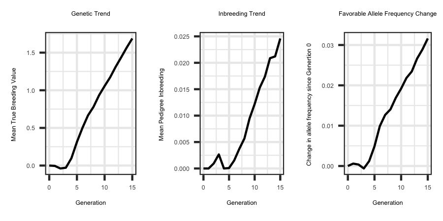
The parameter file outlined below illustrates how to simulate a population undergoing selection and culling based on their true breeding value. The sequence information
generated from Example 1 was available, therefore the 'START' parameter is now founder. Furthermore, the same seed was utilized, therefore the first 3 generations should be
the same as in Examples 1 through 4. After generation 3, changes occur due to a different selection criteria being utilized.
−−−−−−−| Running the Program Example |−−−−−−−
−| General |−
START: founder
SEED: 1500
−| Genome & Marker |−
CHR: 3
CHR_LENGTH: 150 150 150
NUM_MARK: 4000 4000 4000
QTL: 150 150 150
−| Population |−
FOUNDER_Effective_Size: Ne70
MALE_FEMALE_FOUNDER: 50 400 random 3
VARIANCE_A: 0.10
−| Selection |−
GENERATIONS: 15
INDIVIDUALS: 50 0.2 400 0.2
PROGENY: 1
SELECTION: tbv high
CULLING: tbv 5
-| Mating |-
MATING: random125 simu_anneal
Utilizing the R code outlined below the following plots were generated from the output files.
R-Code
rm(list = ls()); gc()
library(ggplot2); library(tidyverse)
setwd("/Users/jeremyhoward/Desktop/C++Code/18_GenoDiver_V3/GenoDiverFiles/")
df <- read_table2(file="Summary_Statistics_DataFrame_Performance",col_names = TRUE,col_type = "dcccccc") %>%
mutate(.,tbv = as.numeric(matrix(unlist(strsplit(tbv, "[()]")), ncol = 2, byrow = TRUE)[, 1])) %>%
select(Generation,tbv)
ggplot(df, aes(x = Generation, y = tbv)) + geom_line(size = 1) + ggtitle("Genetic Trend") + theme_bw() +
theme(plot.title = element_text(hjust = 0.5)) + ylab("Mean True Breeding Value ")
df <- read_table2(file="Summary_Statistics_DataFrame_Inbreeding",col_names = TRUE,col_type = "dcccccccccccccc") %>%
mutate(.,ped_f = as.numeric(matrix(unlist(strsplit(ped_f, "[()]")), ncol = 2, byrow = TRUE)[, 1])) %>%
select(Generation,ped_f)
ggplot(df, aes(x = Generation, y = ped_f)) + geom_line(size = 1) + ggtitle("Inbreeding Trend") + theme_bw() +
theme(plot.title = element_text(hjust = 0.5)) + ylab("Mean Pedigree Inbreeding ") + xlab("Generation")
df <- read_table2(file="QTL_new_old_Class",col_names = TRUE,col_type = "dcccccc")
freq <- matrix(unlist(strsplit(df$Freq, "_")), ncol = 16, byrow = TRUE)
freq <- apply(freq, 2, as.numeric)
X <- which(df$Additive_Selective > 0)
freq[X, ] <- freq[X, ] - freq[X, 1]
X <- which(df$Additive_Selective < 0)
freq[X, ] <- (freq[X, 1] - freq[X, ])
plotdf <- data.frame(cbind(c(0:15), colMeans(freq)))
names(plotdf) <- c("gen", "freq")
ggplot(plotdf, aes(x = gen, y = freq)) + geom_line(size = 1.0) + ggtitle("Favorable Allele Frequency Change") + theme_bw() +
theme(plot.title = element_text(hjust = 0.5)) + ylab("Change in allele frequency since Genertion 0 ") +
xlab("Generation")


